


Table of Contents
- Why Mixing Art Styles Works (and Why It Usually Fails)
- Step 1: Pick Your Anchors and Build a Style Map
- Step 2: How to Create a Cohesive Gallery Wall Across Rooms
- Gallery Wall Layout Ideas That Handle Mixed Artwork
- How to Choose Frames for Wall Art in Different Styles
- How to Style Abstract Art at Home Without Clashing
- Common Mistakes When You Mix Art Styles at Home
- Frequently Asked Questions
Last Updated: October 4, 2026
Why Mixing Art Styles Works (and Why It Usually Fails)
Mixing art styles at home is the practice of pairing artwork from different movements, mediums, and moods in one space so the room feels collected over time rather than bought in a single afternoon. Done well, it adds depth and personality. Done badly, it looks like a clearance aisle.
Most people fail at this for one reason. They buy pieces one at a time, with no plan, and then wonder why the wall feels off. A shared color thread fixes most of it. So does a plan you make before you spend a cent.
At Drunk Girl Art, we sell bold, hand-painted pieces every week, and the question we hear most is simple: "Will this actually work with what I already own?" The answer is almost always yes, if you follow a process.

The five-step method we cover works for a single wall or a whole house. It starts with the one thing most guides skip: a style map.
Step 1: Pick Your Anchors and Build a Style Map
Start with two or three anchor pieces you already love. An anchor is the artwork everything else has to get along with. It sets the color, the scale, and the mood for the room.
Next, build a simple style map. List every room and note three things:
- The main colors already in the room
- The style you lean toward (modern, traditional, folk art, abstract)
- The one piece of art that stays, no matter what
This map stops you from buying on impulse. It also shows you where a gap exists. A plain hallway, for example, is a perfect spot for something loud.
A common mistake is treating every room as its own island. In practice, the best homes repeat one or two colors from room to room. That single thread is what makes a house feel cohesive.
Step 2: How to Create a Cohesive Gallery Wall Across Rooms
A cohesive gallery wall uses one shared element across every piece, usually color, then varies everything else. That is the whole trick. One thing repeats, the rest can differ.
Here is how to create a cohesive gallery wall that works across several rooms:
- Pick your shared thread. Color is the easiest. Blue, orange, or a warm neutral all work.
- Gather your art. Mix framed art, canvas prints, and one metal piece.
- Cut paper templates the same size as each frame.
- Tape the templates to the wall and live with them for a day.
- Adjust spacing until the group feels balanced, then hang.
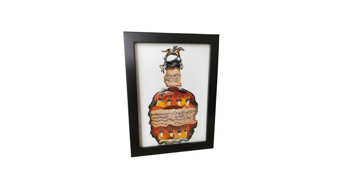
Keep gaps between frames consistent, roughly 5 to 8 centimetres, so a dense display still reads as one group. Repeat one color in every room and the whole home ties together.

Gallery Wall Layout Ideas That Handle Mixed Artwork
The best gallery wall layout ideas solve one problem: how to arrange pieces of different sizes without chaos. The answer is to pick a shape first, then fill it.
Four layouts handle mixed artwork well:
- Grid: all frames the same size, evenly spaced. Calm and modern.
- Salon: a dense display, edge to edge. Best for a staircase or tall wall.
- Center-out: one large anchor, smaller pieces radiating around it.
- Shelf: art resting on a ledge, so you can swap pieces any time.
Scale matters more than most people think. A large wall needs one big piece or a tight group. One small print alone on a big wall looks lost every time.
For a staircase or stairwell, follow the angle of the steps. Keep the bottom edge of the group parallel to the rail. That single line makes a tricky space look intentional.
How to Choose Frames for Wall Art in Different Styles
Choosing frames for wall art comes down to one rule: match the frame to the room, not to the art. The frame is the bridge between a bold piece and your existing decor.
Think of every piece as having four dials: frame finish, frame width, mat, and glass or surface. You only need to lock one or two dials across a room. The rest can vary freely.
- Lock the finish, vary the width. All-natural wood frames in different widths read as one family while still letting a large piece feel heavier than a small one.
- Lock the width, vary the finish. Slim frames in black, brass, and white look deliberate on a mixed wall because the eye reads the consistent edge first.
- Lock the mat, vary everything else. A consistent white mat with a generous border is the single fastest way to unify wildly different art styles.
- Lock nothing, repeat one color. If you want a truly collected look, let frames differ but repeat one frame color three times across the wall.
A few pairings that hold up in practice:
Art Style |
Frame Choice |
Why It Works |
|---|---|---|
Thin black or natural wood |
Lets the color lead |
|
Traditional painting |
Wide, ornate, warm tone |
Matches the period feel |
Folk art |
Simple light wood |
Keeps it casual |
Black and white photo |
Slim black metal |
Sharp and clean |
Mixed media |
Float mount, no mat |
Shows the texture |
Vintage botanical |
Warm wood with a wide mat |
Gives an old print breathing room |
Contemporary photography |
White or light oak, no mat |
Keeps the image as the focus |
If you are unsure, use the same frame across every piece in one room. A shared frame is the fastest way to make very different art feel like one collection.

Mat width is the most underrated dial. A narrow mat (roughly 5 centimetres) makes a small print feel bigger and more important.
Durability and shine matter too. Metal prints shrug off kitchen steam and bar splashes far better than paper. In a busy room, that is worth the upgrade.
One more trade-off worth knowing: ornate frames add age and weight, but they also demand more wall space.
How to Style Abstract Art at Home Without Clashing
Styling abstract art at home is easier when you treat it as the loudest voice in the room. Give it space, give it a plain wall, and let it speak.
Three moves that stop abstract pieces from clashing:
- Keep the wall behind it simple. Skip busy wallpaper.
- Pull one color from the art into a cushion, rug, or bowl.
- Leave breathing room. Do not crowd a bold piece with knick-knacks.
If you lean minimal and neutral, you can still hang bold work. One large abstract on a white wall reads as a deliberate focal point, not a shout. Start with a single piece and live with it for a week before adding more.
This is where a hand-painted original earns its place. A one-of-a-kind piece carries texture and movement that a flat print cannot copy. That difference is exactly what makes a mixed wall feel collected instead of catalog-ordered.
Common Mistakes When You Mix Art Styles at Home
The fastest way to fix a mixed wall is to know what usually goes wrong. These mistakes cover most of it, and each one comes with a measurable fix so you can diagnose a wall you already have rather than starting over.
- No shared color. Every piece is a different palette. Fix: repeat one color in each room. Pick the color that already appears most in your furniture, then make sure at least one element in every artwork group echoes it.
- All the same size. A row of identical frames looks flat. Fix: mix one large piece with smaller ones. A workable ratio is one piece at roughly twice the area of the next largest, with the rest smaller still.
- Frames fighting the art. A heavy gold frame on a bright abstract. Fix: match the frame to the room, not the art, and lock one dial (finish, width, or mat) across the group.
- Hanging too high. Art should sit at eye level, roughly 145 centimetres to the center. Fix: measure before you drill. In a room where people mostly sit, 140 to 150 centimetres to center is the safe range.
- Buying all at once. A wall bought in one day looks like a showroom. Fix: add pieces over time, and let each new piece answer a color or shape already on the wall.
- Inconsistent spacing. Gaps that drift from 3 centimetres to 12 centimetres make a group read as separate pieces. Fix: keep gaps between frames consistent, roughly 5 to 8 centimetres, so a dense display still reads as one group.
- Competing focal points. Two bold pieces on facing walls in a small room fight each other. Fix: give one wall the spotlight and keep the opposite wall quiet, or separate the two bold pieces with a neutral buffer.
- A palette that feels disconnected. Three unrelated accent colors across one wall. Fix: cap the wall at two accent colors plus a neutral, and pull both accents from at least two pieces each.
Budget and sourcing matter here too. You do not need to spend a fortune. One strong original plus a few smaller prints goes further than ten cheap pieces that all look alike. A common pattern is to build a wall in three passes: one anchor piece first, two or three mid-size pieces second, and small filler pieces last.
If a wall still feels off after these fixes, the problem is usually scale, not style. Step back and squint. If one piece dominates everything else, it is too large for the group. If the group reads as a single gray blur, the pieces are too similar in size and tone.
Frequently Asked Questions
Can you mix different styles of art in one home?
Yes. The trick is repetition, not matching. Repeat one thing across every room: a color, a frame finish, or a subject theme. A home bar with colorful cocktail art, a kitchen with wine prints, and a hallway with abstract pieces can all read as one collection if the same two or three colors appear in each. Drunk Girl Art's wavy, funky style makes this easier because every piece already shares a similar energy and palette.
What is the 70/30 rule in art?
The 70/30 rule says roughly 70% of your art should follow one dominant style, palette, or subject, and about 30% can break from it. That ratio keeps a room from looking like a showroom set while still letting bold pieces stand out. If you own ten pieces, seven might be neutral or traditional and three might be loud, colorful abstracts. Flip the ratio and the room starts to feel chaotic rather than collected.
How do you choose frames for different styles of art?
Use frames as the glue. If your artwork varies wildly in style and color, keep frames consistent: same finish, same width, same profile throughout the house. Black frames work with almost anything and read as a deliberate choice. If the art is already cohesive, you can vary the frames instead. Pick one variable to control and let the other one run free.
How do you make different art styles look cohesive?
Repeat three things: a shared color palette, consistent spacing between pieces, and one repeated material such as black frames or canvas. A shared color is the strongest unifier, so pull one hue from each piece and make sure it appears in at least one other artwork nearby. Consistent spacing (5-8 cm between frames) does more for cohesion than matching styles ever will.
Mixing art styles is not about matching everything perfectly. It is about one thread, a little patience, and the confidence to let a bold piece lead. If you want a starting point that already carries color, movement, and personality, Drunk Girl Art has you covered with original hand-painted work, free shipping @$79 and 24/7 customer support. Shop Now and build a wall that looks like you.


Leave a comment